Figuring Out What Works -
Designing the
User Experience of the Doing What Works Podcast Website
Project Challenge
Project challenge was to design a website that was approachable, that also defined to the user the concept of the blue economy. Through research and analysis, I drafted wireframes envisioning the potential user experience for the Doing What Works website.
Project Role
UX Designer tasked with creating a wireframe of the website for the Doing What Works Podcast. Goal was to try and design the website in a way to support the podcast content while also designing the site to be approachable for new users. For example I created wireframes focused on finding more information on job certificates.
My workspace in Figma, where I created all of my wireframes for this project
Stakeholder Kickoff
The design process began with a stakeholder kickoff where as a class we had the opportunity to ask questions to are stakeholders. Key insights gained from this experience included . . .
1) Stakeholders want the website to be approachable, an important insight that shaped how I would approach designing the visual hierarchy of the website
2) The podcasts identity is not centered around the blue economy, so the website does not need to be themed around the blue economy.
3) Target audience is aimed towards people who have a preexisting for topics covered in the podcast.
Netnography
For my netnography I did research on online community and engagement with posts of the social media websites Twitter/X and Instagram focusing on the topic blue economy and local environmental activism.
Key Insights From Netonography
1) Low engagement on Blue Economy related and Local Environmental Activism posts.
2) Difficulty finding discussions of the blue economy on social media.
Due to limited engagement on these posts, it could represent the possibility that the target audience is more likely to engage with this topic outside of digital spaces, or maybe on more private forums.
Card Sort
Using a list of potential features I conducted a card sort with an SMC student by asking them to organize the features in a way that made sense to them.
The results from this card sort gave me inspiration on how I would organize the main site navigation
Scenarios
I drafted several scenarios based around different ways the user would engage with the website.
One such scenario focused on using the website to learn more about specific certificates
Using these scenarios as reference point, I sketched a wireflow of how a user would engage with the website with the intention of learning more about a specific certificate mentioned in the podcast.
Initial Wireframes
Initial Wireframe of the homepage created using the website Figma.com
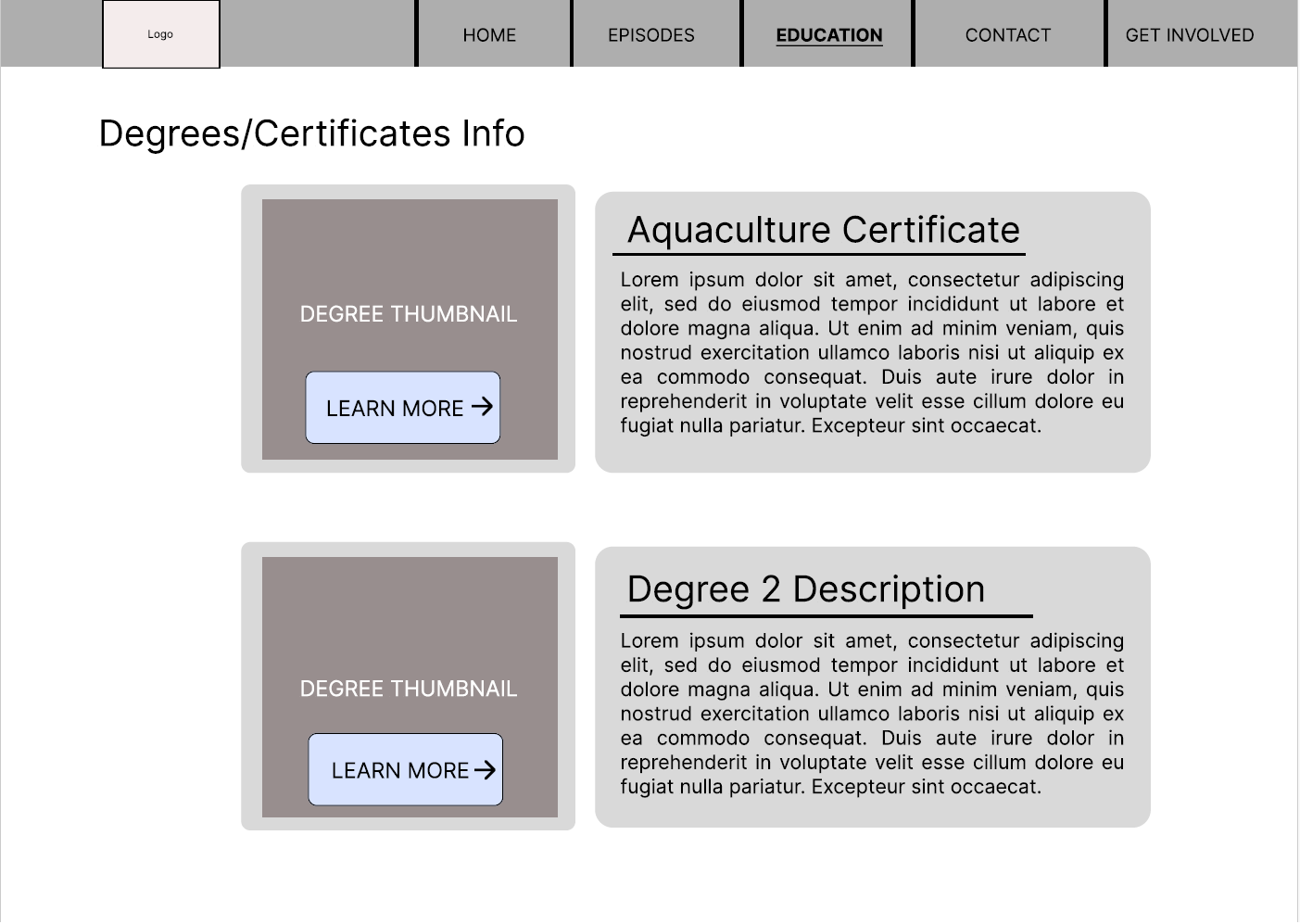
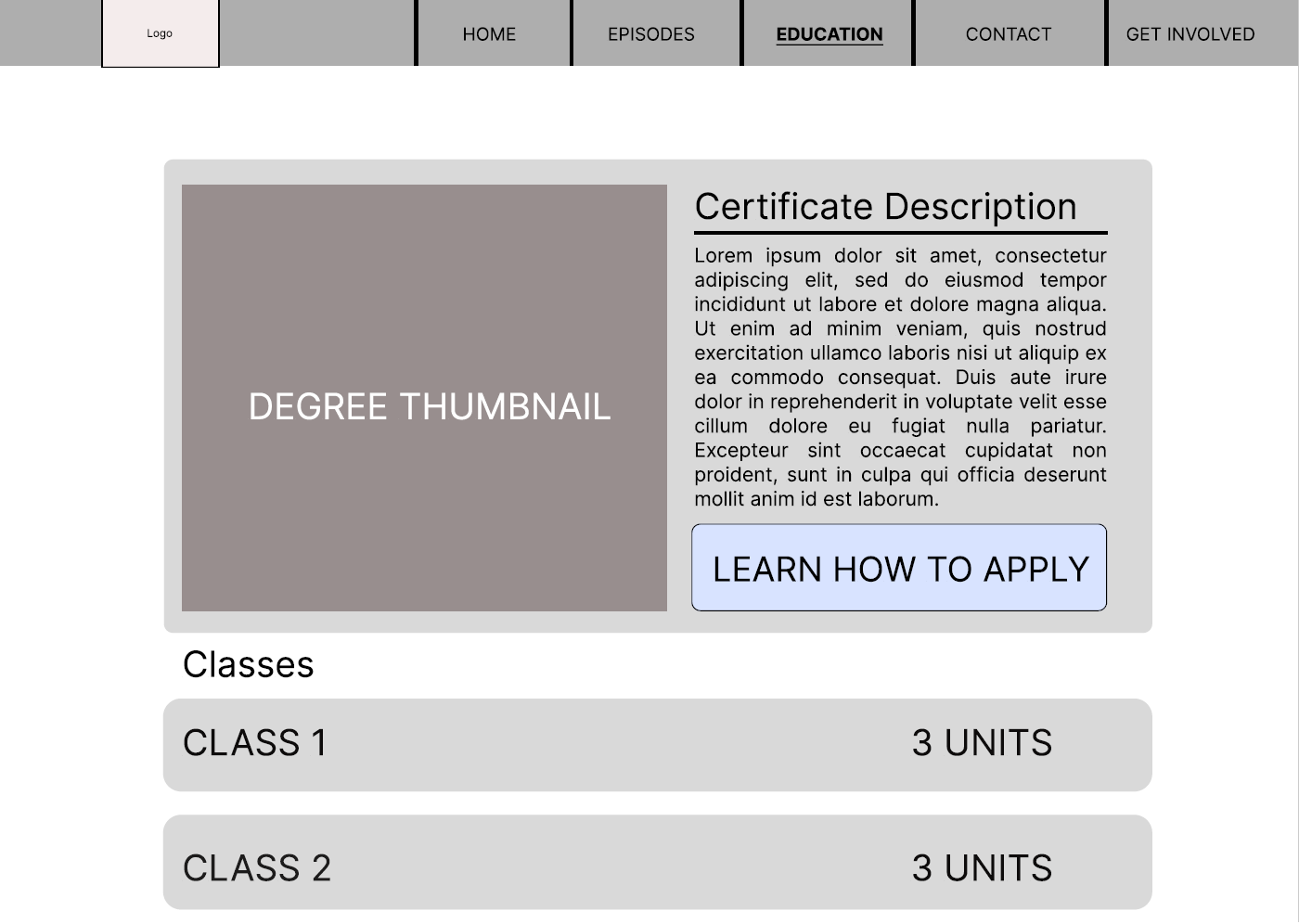
These initial wireframes aimed to showcase the scenario of seeking info about various education paths
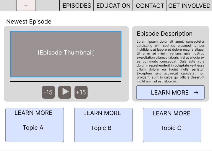
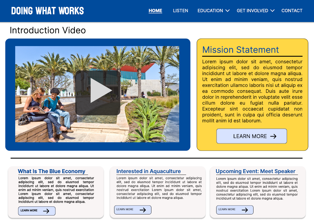
Initial wireframe of homepage
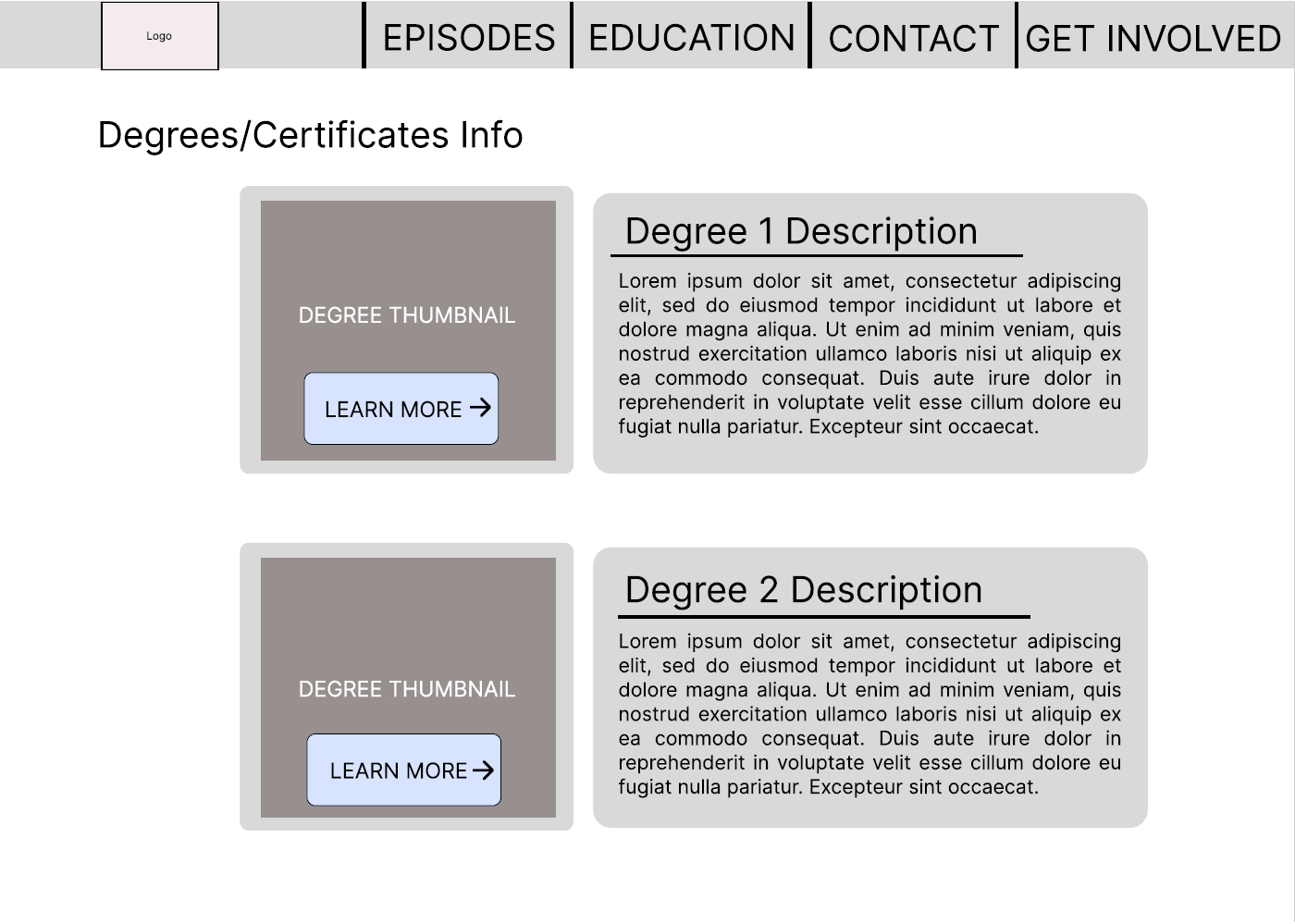
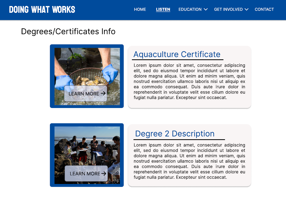
Initial wireframe of Degrees & Certificates page
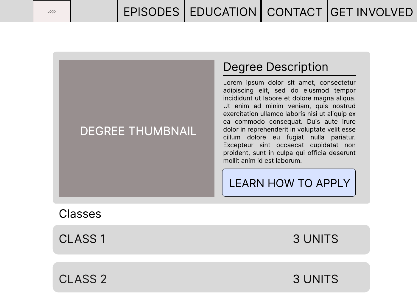
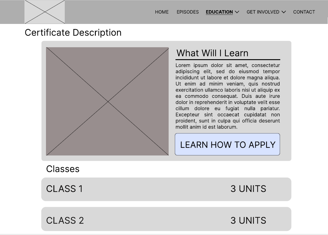
Initial wireframe of Certificate Description page
Wireframe Iterations
Updated wireframes based off of feedback from classmates and the professor.
Changes made include the resizing of text on the navigation, as well as the bolding and underling of the main navigation tab of the current page the user is on.
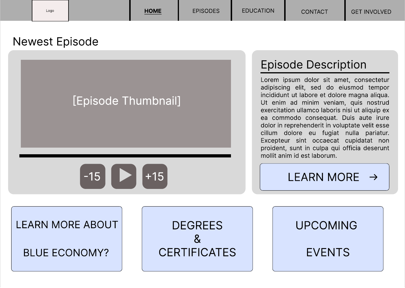
User Testing
After iterating on my wireframes, I ran several user tests. In this user tests I asked each user to engage with the wireframe as if they were using a real website. Here are some insights from the responses.
Final Result
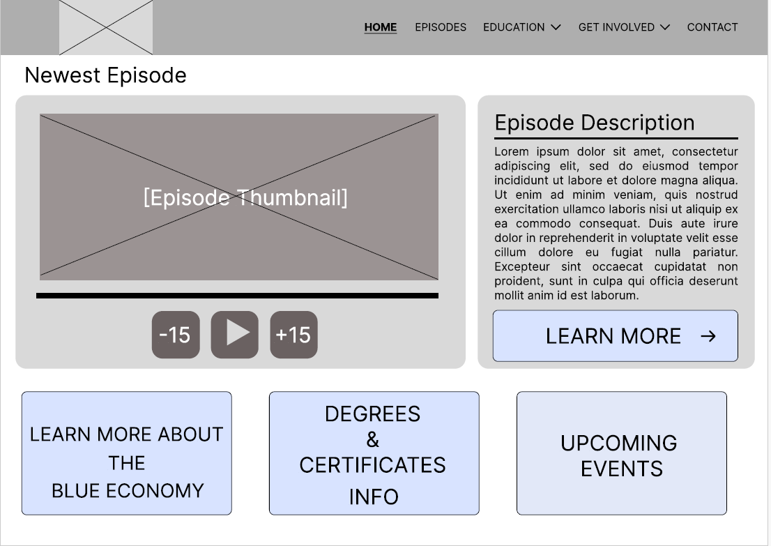
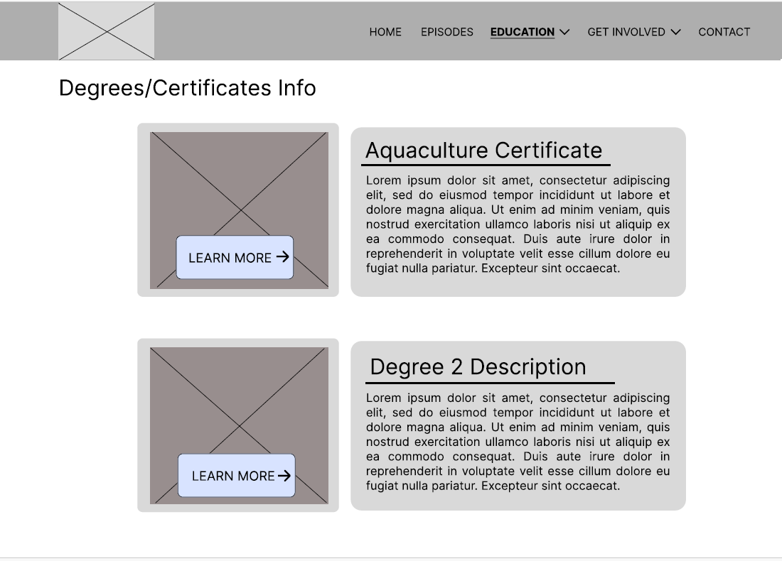
Taking inspiration from based on feedback from the user testing I made some minor adjustments to my wireframes
These changes included simplifying the look as well as reorganizing the placement of elements on the primary navigation bar.

In retrospect, this project has ingrained in me the value of reflection and iteration. Through every research method I engaged with on this project I came away with an insight that had an influence on my final wireframes.
Through reflecting on those insights from the research, as well as feedback from user interviews, I worked on my wireframes approaching the work with a new perspective and went through the process of refining the wireframes.
With each iteration of the wireframes presented, I received new feedback which in turn led to new inspirations for improving my work. From my experience working on this project I have gained new perspectives on the value of approaching your designs through new perspectives that were gained through new insights.